
Email Marketing Guide: Design tips for hotel email marketing campaigns.
There are numerous factors that make one design more effective than another.

In addition to knowing when and to whom to send the appropriate campaigns, an optimal user experience through design and usability is also crucial to achieving the desired conversion goals.
An email, just like any other design, has a goal. And this must determine the design of the email, not the other way round. In general, a design is considered to be well executed when it achieves the set goal, regardless of its artistic design.
When sending an email campaign, we are opening a door for our brand. We cannot afford to give a bad impression to those viewing and interacting with our emails. The right use of fonts, logos, images, colours, designs and tone must reinforce brand awareness in other channels while offering a good experience, with a design that adapts to several device sizes.
In general, an email that supports and is in line with a brand strategy tends to convert 27 % more than one that is not. It is a figure attractive enough to take the right use of the brand in our emails seriously.
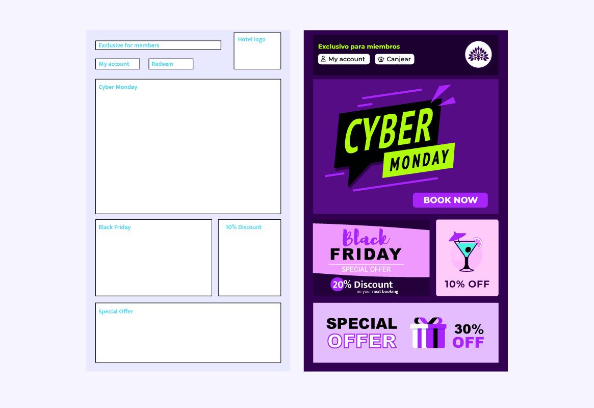
In this sense, it is highly recommendable to have templates designed for campaigns. A template can be used multiple times to improve the cognitive knowledge of our customers while optimising design times.
When a customer receives emails with similar designs, they know where the relevant information is, therefore, the user experience improves which consequently means more conversion.
Important elements in an email
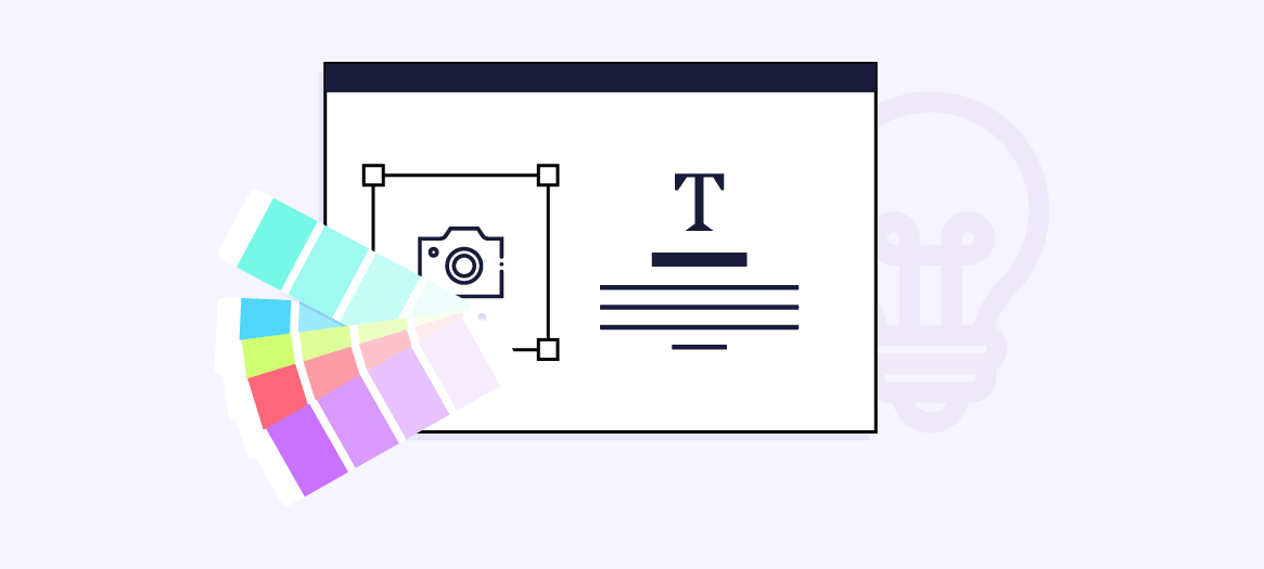
1. IMAGES
All marketing departments and designers love images. They are much more effective to create brand awareness than text; users are more likely to click on images; they reinforce the message. But using too many images in emails can be counterproductive. To follow, you will find some of the most important reasons to be cautious when it comes to using images in email designs.
Normally, the optimal ratio when it comes to email design is 70 % text and 30 % images. We must keep this ratio in mind when it comes to designing effective, multi-platform emails.
- An email with too many images can be identified as spam since malicious emails often disguise fraudulent links with images.
- Mail clients generally block emails whose content is exclusively images as a spam-prevention practice or can even send these emails directly to the bin.
- Mail clients usually block images and ask the user for confirmation to show them as a safety measure, which means that customers could open the email and find a blank screen.
- Screen readers are unable to read text that is rendered in an image.
- Emerging technologies such as Alexa, Google Home, Cortana, Siri… cannot read a message within an image either.
- In mobile devices or when there is low connectivity, images will cause the email to load more slowly therefore lowering conversion.
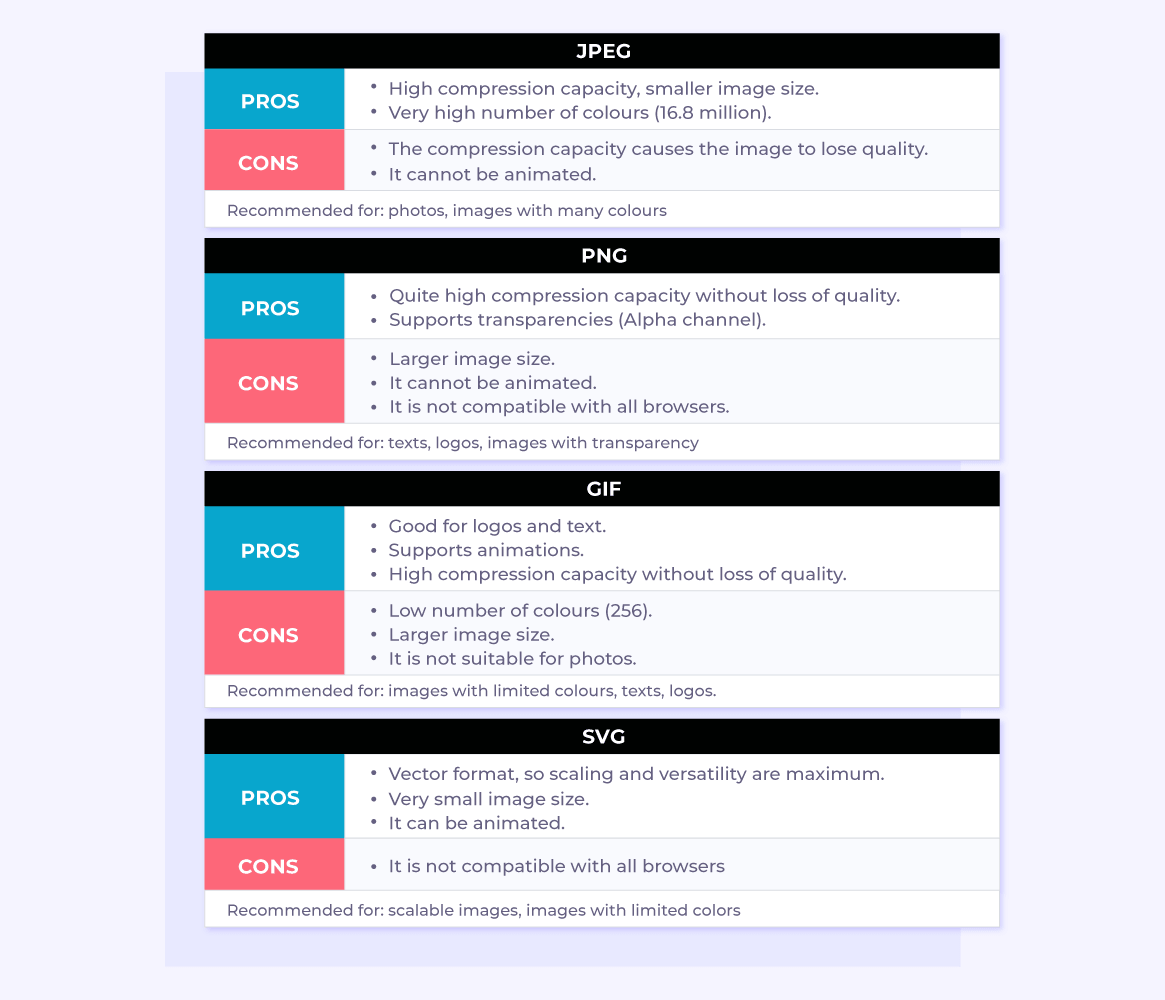
Recommended formats
Considerations when working with high DPI screens
The proliferation of high pixel density screens (Retina, AMOLED, Super AMOLED…) means that we must pay special attention to the quality of images when working on emails. Especially, those that are going to be viewed in mobile devices.
When a user with a retina screen opens an email conceived for a screen with average pixels density, it is very likely that many, if not all, images lose certain quality and appear blurred. It does not offer a great user experience and that sense of lack of attention to detail is damaging to the brand.
Many designs incorporate images twice the normal size to minimise that effect, escalating the image subsequently to the original size, hence doubling the number of pixels and preventing the image from being blurred. We must be aware that images are going to be downloaded by a user with a certain contracted data plan and therefore we must be careful with the weight of the image, using the most suitable format and compressing it as much as possible.
We must also keep in mind a fall back of the same image if the screen has an average pixels density. In this case, it would not be necessary an image twice as big, hence the email would weigh less using the image that best suits the device. Nowadays, we can use CSS techniques and attributes to achieve the desired effect when it comes to loading the most suitable image according to the circumstances.
Remember that:
- Using the ALT attribute (alternative text) of images to help compress the same should this not be shown.
- Avoiding, as much as possible, the use of stock images that sometimes can make the message less credible or can generate potential copyright issues.
- Keeping at bay the size of the images used in the email; we recommend to have a total budget of 100 to 150 kb.
2. FONTS
The cornerstones of a good design are the fonts, pictures and colour. Not only they are helpful in terms of brand awareness but a font that is selected properly helps to understand the message and improves user experience.
It is important to select the font that best suits the goal and the audience in order to ease the attention and word scanning span.
- Web Fonts
Sites such as Google Fonts allow to download or link hundreds of different fonts to a website. There are many more places, of course, where they can be purchased or downloaded. This opens a whole new world of possibilities for designers since it grants them access to many more fonts to choose from to make their designs come to life. Also, in those cases where the mail client does not support the chosen web-font, we can always select a web-safe font to replace it.
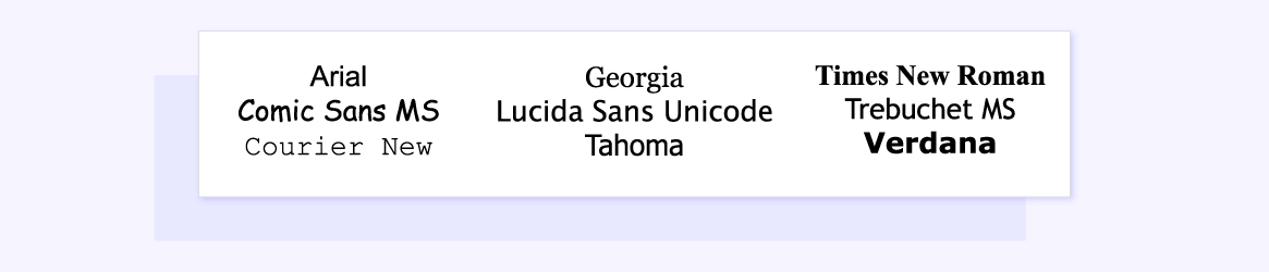
- Web-safe Fonts
Unfortunately, developments in the use of web-fonts have not been reflected in some mail clients, which means that we may find that the font we use in our emails is not supported by some mail clients and therefore we may have to use the so-called web-safe fonts, such as:
When the user’s mail client is not able to render the selected web, it will use a fall back font to show instead.
Luckily, we can tell the mail client which fall back font we would like it to use, as long as it is available for the system. In any case, we can ask the mail client to use a serif or serif sans font… as a last resource within its system’s font catalogue.
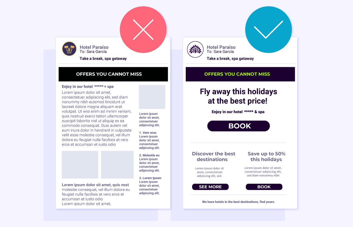
3. USE OF TEXT
It is important for the message not to be too long or we may risk losing the reader’s interest. The user must be able to quickly scan the message and the way it is composed must facilitate this task.
To help with the scanning, we must define some visual guidelines, a hierarchy and a composition within the message:
- Starting with the most important text, which we want the user to read first
- Playing with the font size and negative spaces to give more or less relevance to more or less important elements.
- In general, it is recommended to go from bigger to the smaller font size.
We must be clear and concise, transparent for the user to understand the message; it is also important to deliver just one message in the same email. We must use visual hierarchy to help the user understand which is the main message and which are the secondary ones.
We must not add any non-essential elements that may dilute the message; it is important that the message is clear. Any additional elements that distract the user from the main goal of the email can lower the conversion rate.
We must not give too many options to the user or they will hesitate. The cognitive load that the user needs to make a decision can lower email conversion. If we want to sell a product with an email, we must not present the whole catalogue in this but we must try to create an email that intrigues the customer and raises interest in the most sold product or a product that may be of their interest and subsequently, gradually, introduce the rest of products.
4. THE USE OF TEXT AND SPAM
In addition to reviewing elements such as images to identify an email as spam or not, many ISPs also inspect text; this is why it is important to meet certain guidelines when it comes to writing the copies of your messages:
- Avoid using capital letters
- Avoid using too many exclamation marks, use just one
- Avoid using extravagant words or subjects that may identify the email as spam such as: free, urgent, promotion, money, offer, cheap, winner, etc.
5. CTA
If we think about all the emails we receive daily, many of them clearly show an element such as a button or an attractive image with a flashy text. These sort of elements are what we call call to actions (CTA).
The best way to increase conversion is to create a good CTA. Delivering a clear message to the user of what we want to offer them or what they will achieve if they execute the action we are proposing to them.
- They represent an action in a clear and attractive way
- They are easy to recognise in the email design
- They are brief but not boring in the message
- They create a sense of urgency or need in the user (careful with spam)
It is important to be careful with the hierarchy in the message when adding the CTA while trying that the message is always visible when the user opens the email so that they do not need to scroll down.
Likewise, the blank space around the CTA must not be covered with other elements within the message. It must be clear for the user which is the action we want them to execute.
6. USE OF COLOUR
Good use of colour is important to help highlight the message or other elements within the same. Obviously, a brand can have guidelines in terms of the use of colour that must be met in their communications since colour is an important part of the brand and therefore an easily recognisable element within designs.
It is crucial to use the most suitable colours for the message we want to deliver. There are many studies and articles about the psychology of colour that are worth reading.
Complementary colours are essential. There are rules about the use of colours (such as the use of colour theory) that will make emails more effective.
>>In the next article we will cover in more detail the use of persuasion and emotions when composing the text of an email to achieve conversion goals.